Pokiddo Creates a 360㎡ Parent-Child Playground Next to a South African Restaurant, Ingeniously Solving the Red-Yellow-Blue Color Matching Dilemma
- Share
- publisher
- Lena Zhang
- Issue Time
- Jul 30,2025
Summary
Pokiddo designed a 360㎡ S.African playground by a restaurant, with red/yellow/blue (hard to match) on black-gray mats, delighting 3-12s with zones like party room.

Pokiddo Creates a 360㎡ Parent-Child Playground Next to a South African Restaurant, Ingeniously Solving the Red-Yellow-Blue Color Matching Dilemma
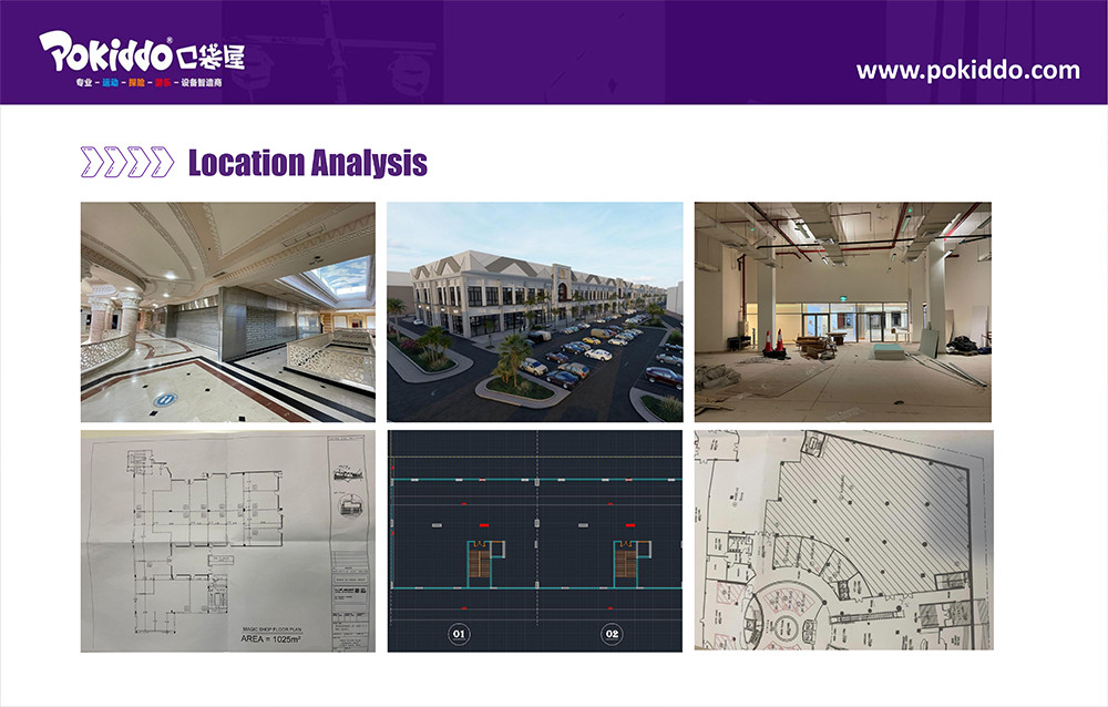
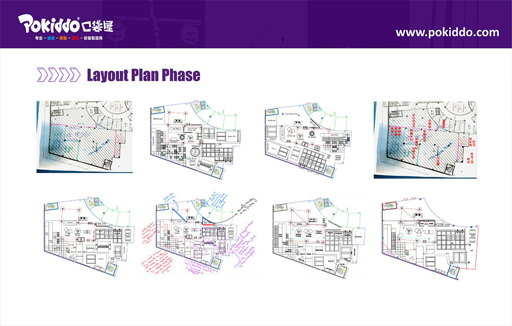
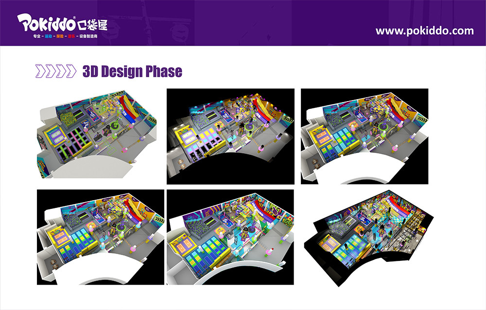
Next to a popular restaurant in South Africa, the 360㎡ children's playground designed by Pokiddo has become a new favorite among family customers. This space with a net height of 3.4 meters is specially built for children aged 3-12, covering functional areas such as an indoor playground, slides, a toddler zone, a party room, and a reception desk. What is most commendable is that the designers successfully managed the customer's favorite red, yellow, and blue colors - a set of colors that are conflicting. Finally, against the black and gray floor mats, they present a harmonious effect full of vitality, perfectly exceeding the customer's expectations.
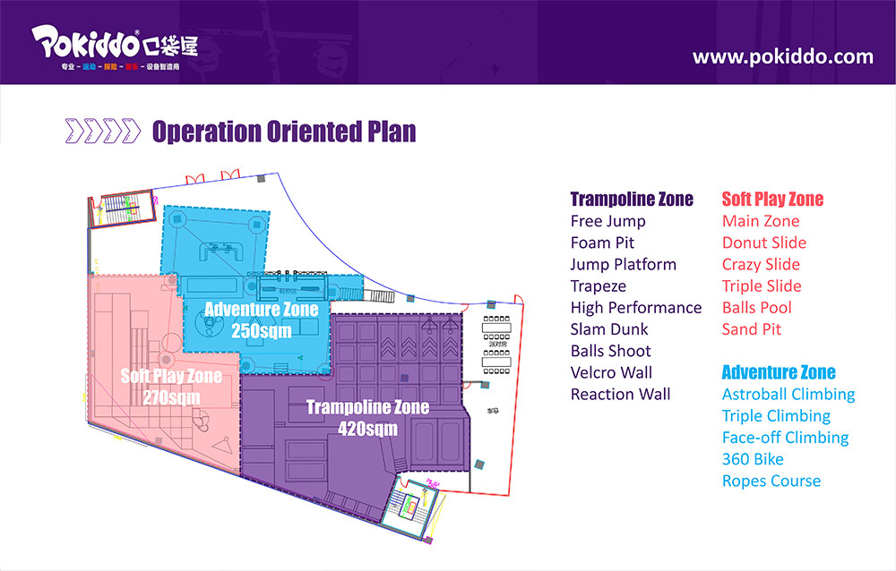
Age-Appropriate Design, Catering to Children's All-Day Fun
The 360㎡ space is precisely divided to meet the needs of children of different ages:
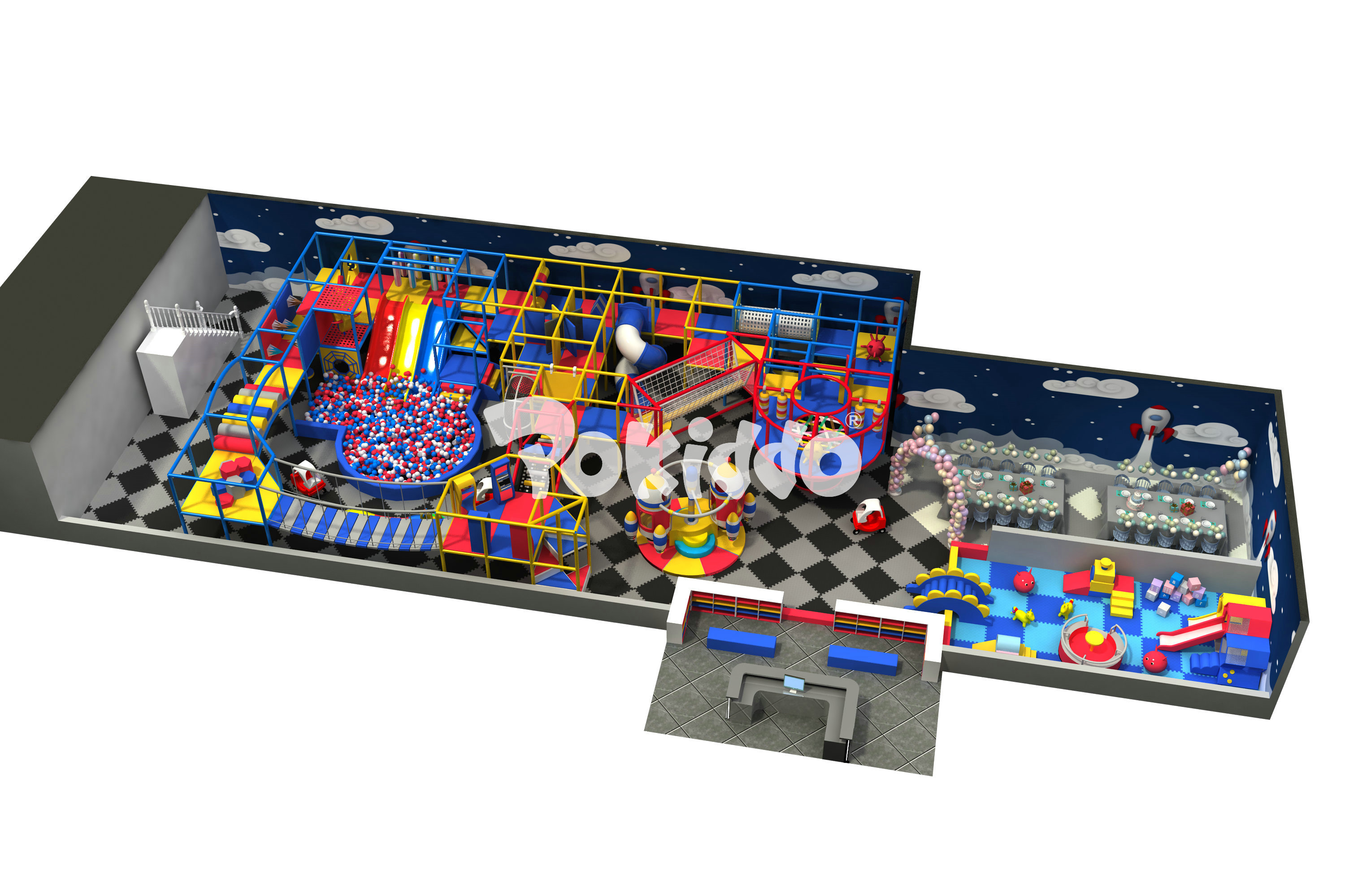
1. Core Indoor Playground
The multi-layer structure features red and yellow frames, paired with blue climbing nets and tunnels. Children aged 8-12 can climb and shuttle through it, challenging their physical strength and courage. The vivid color collision stimulates vitality, which perfectly matches the exploration desire of older children.
2. Slide Cluster:
The yellow spiral slide and red straight slide extend down from the indoor playground, with soft buffer pads at the landing points. There are gentle slope designs suitable for young children and exciting fast descent experiences that make older children scream. The blue handrails ensure safety and echo the overall color tone.
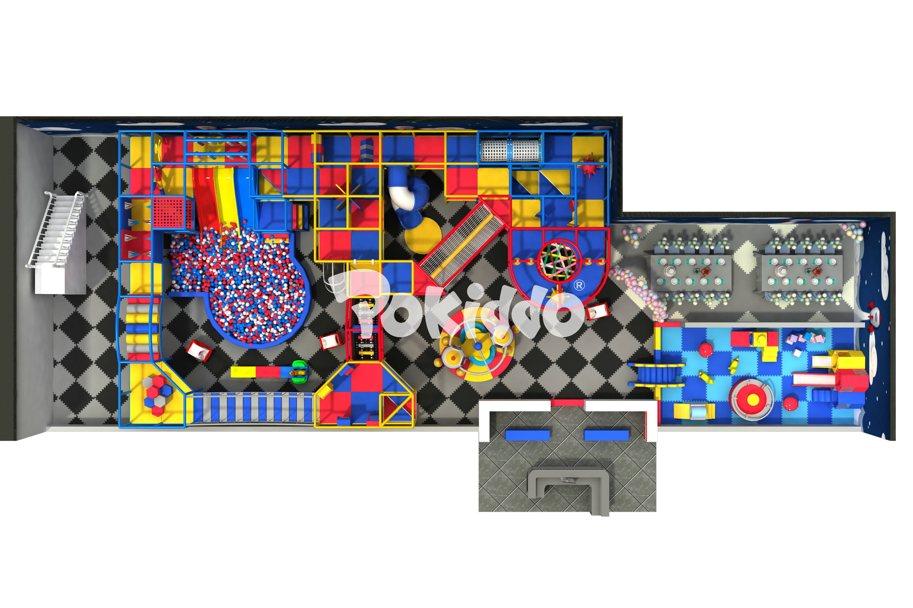
3. Exclusive Toddler Zone (3-7 years old):
It takes blue as the main tone, paired with round yellow soft building blocks and red mini crawling holes. The low-lying facilities and rounded corner designs fully guarantee safety. The black and gray floor mats extend here, making the soft colors look more refreshing and avoiding visual fatigue for young children.
4. Party Room:
Red, white, and blue balloon strings and theme walls of the same color system create a festive atmosphere, which can accommodate 15-20 people for birthday parties. The cartoon patterns on the walls cleverly integrate the three colors, being lively but not messy, and becoming an exclusive place for children's social gatherings.
Breaking the Red-Yellow-Blue Dilemma: "Painting" a Harmonious Feeling on the Floor Mats
Black and Gray Floor Mats Setting the Tone:
✅ With dark gray floor mats as the "canvas", the activity of the space's background color is reduced, giving the bright red, yellow, and blue color blocks a calm background. Visually, it shows more layers and avoids the clutter of color "conflicts".
Proportion Allocation Controlling the Scene:
✅Blue accounts for about 40% (such as walls, handrails, and the main color of the toddler zone) as the base color to balance the vision; red and yellow each account for 30%, distributed in the form of slides, frames, decorations, etc., forming "pop colors" without being eye-catching.
Regional Focus:
✅The older children's area strengthens the contrast between red and yellow, using high-saturation colors to ignite enthusiasm; the toddler zone weakens conflicts, with blue as the main color and red and yellow as embellishments, adapting to young children's needs for a soft environment. White lines serve as transitions to make the connection of color blocks more natural.
The customer praised during acceptance: "I was originally worried that the colors would be too dazzling, but I didn't expect it to be so harmonious - this is exactly the vitality I want!"
Restaurant + Playground: Unlocking a New Parent-Child Consumption Scenario
The "adjacent mode" of the playground and the restaurant enables family customers to seamlessly connect "dining + taking care of children". When parents are dining in the restaurant, they can clearly see their children's movements in the playground through the floor-to-ceiling windows; children will take the initiative to pull their parents and say: "Let's go to the restaurant next to that colorful playground for dinner!"A local mother shared: "The black and gray floor mats look particularly clean, and red, yellow, and blue are especially attractive to children. Now we bring our children here every week. He has fun, and we can eat at ease. It's so convenient!"
From conflict to harmony, from a single function to scene integration, this South African project once again proves that there are no unmanageable colors, only improper methods. Pokiddo has always believed that good design can accurately match the space with needs. Even a 360㎡ "corner space" can be transformed into a treasure place for family customers.
Want to add a parent-child attribute to your commercial space? Visit the official website www.pokiddo.com and let our designers customize a plan for you.

If you’re looking to create a unique indoor sports park, Pokiddo is your trusted partner. Let’s work together to build something extraordinary!
#Pokiddo #SouthAfricanChildren'sPlayground #IndoorPlaygroundDesign #RedYellowBlueColorMatching #Parent-ChildRestaurant #Age-AppropriatePlayArea #CommercialSpaceRenovation


Are you interested in our products? Please contact me
Better Copy Here:
Lena Zhang ( Sales Manager )
Mobile/Whats' App/Wechat : 0086-15356539170
Email : sales09@pokiddo.cn