How to make the visual design of the trampoline park better reflect its brand concept?
- Share
- publisher
- Katherine Zhang
- Issue Time
- Dec 21,2023
Summary
This article discusses how to reflect the brand concept of a trampoline park through its visual design. Brand concepts are often rooted in emotions and social culture and can be visually represented through a combination of colors, patterns, graphics, and images.


How to make the visual design of the trampoline hall better reflect its brand concept?
The setting of brand concepts usually originates from people's psychological emotions and social culture, and emotions and culture will have certain visual connections and associations. For example, if we say that a person has a "craftsman spirit", then a picture of a craftsman focusing on his work will appear in your mind.
It is also because of the corresponding relationship between brand concept and visual association that we can connect a certain concept with certain visual elements, or use a combination of several visual elements to strengthen the recognition of the brand concept. Brand vision is an overall impression, including basic elements such as color, shape, graphics, and images. The following explains how to embody the brand concept through visual design from several aspects.


1. The brand logo of the trampoline park
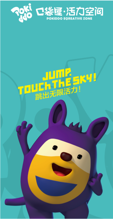
The logo of a trampoline hall is like the face of the venue. Just like a human face, it can be ordinary and bland, or it can also have "temperament".
Therefore, from now on, trampoline park investors can also check for themselves whether the brand you operate presents the brand concept and personality in the logo design, and whether it has a unique temperament?
2. The color of the trampoline park brand logo plays a crucial role in achieving differentiation and recognition. However, it's important to remember that the use of colors should have its own unique characteristics and not just blindly follow alternative colors. The color choice should have a distinctive concept behind it, making it an excellent visual element for the brand.
3. The pattern of the trampoline park brand logo can enrich visual presentation, strengthen display effects, stimulate brand association, and contribute to the overall brand image in communication. Incorporating auxiliary patterns or graphics related to the brand logo can add flexibility and diversity.
3. The pattern of the trampoline park brand logo can enrich visual presentation, strengthen display effects, stimulate brand association, and contribute to the overall brand image in communication. Incorporating auxiliary patterns or graphics related to the brand logo can add flexibility and diversity.
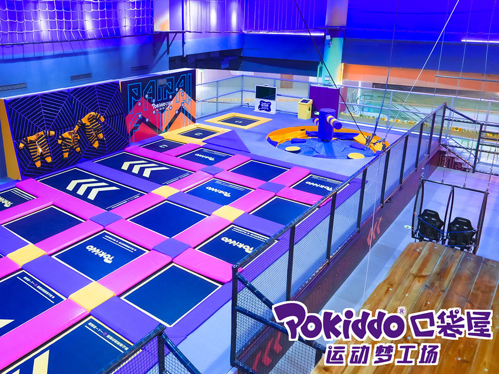
4. An image of a trampoline park brand represents a true visual description of the objective world in which the brand exists and relates to, whereas the brand graphics mentioned earlier are mostly abstract expressions with "freehand" design. In contrast, brand images tend to be "realistic" and depict users, products, services, and specific usage scenarios of the brand. This provides a clear understanding of how these aspects interact with each other.
Brand images better enhance the appearance of brand concepts by presenting a more concrete vision and intuitive association. Visualizing these aspects through images contributes to establishing the overall impact of the brand. How to run a successful trampoline park?
trampoline park enterprise al
toddler time trampoline park
trampoline park basketball
altitude trampoline park waiver
1.